double bay
–
design architects / andy harding & andrew stanic
project team / rasmus lund, binghi lamerton, sven bjerkhamn
interior design, furniture + soft furnishings / Interni pty ltd
project team/ louise bell, shane gogan, vick hon briggs, laura staude
builder/ toki constructions pty ltd
industrial designers/ TILT Industrial Design pty ltd
joiner/ blank joinery
landscape/ dangar barren smith
electrical/ rylec pty ltd
planner/ laura reid, mersonn pty ltd
photography/ nicholas watt, andy harding
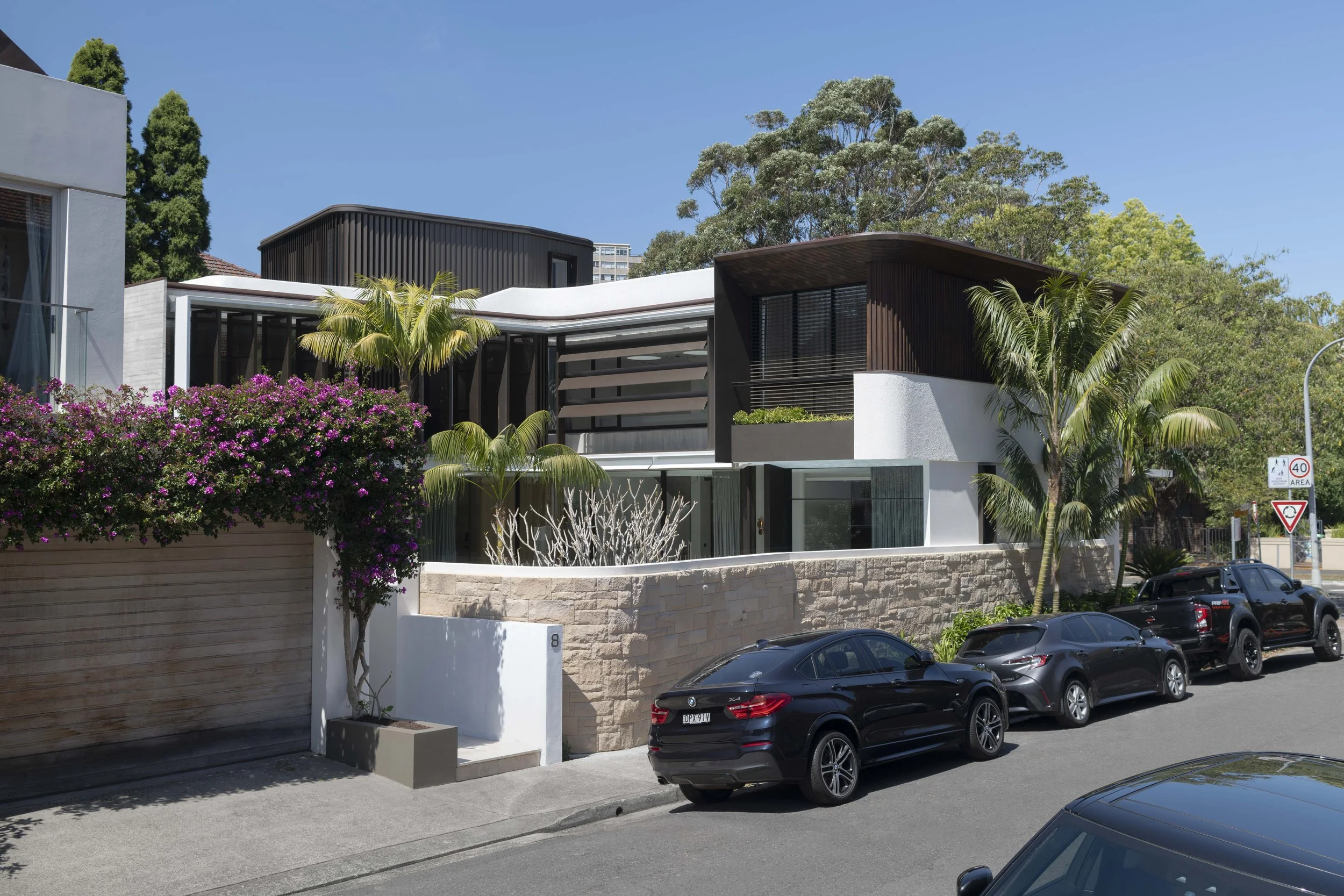
This house embraces its family of five, its context, its courtyard and its north western orientation.
The tight corner site is bounded by a heavily trafficked street to the south and a secondary street to the west carrying slow moving cars and beachgoing foot traffic. A pair of handsome contemporary town houses sit to the north of the site while a three storey interwar apartment block running the full length of the eastern boundary is screened by conifers. The original house was poorly oriented, could not accommodate the required amenity and the family’s needs and had no architectural merit.
Our primary strategy was to open the house and the courtyard to the north western light and sky. The living spaces address the courtyard offering direct visual and physical connections to the garden and pool. This open facade is contrasted with the more shielded southern and western façades protecting the occupants from the busy street noise and overlooking.
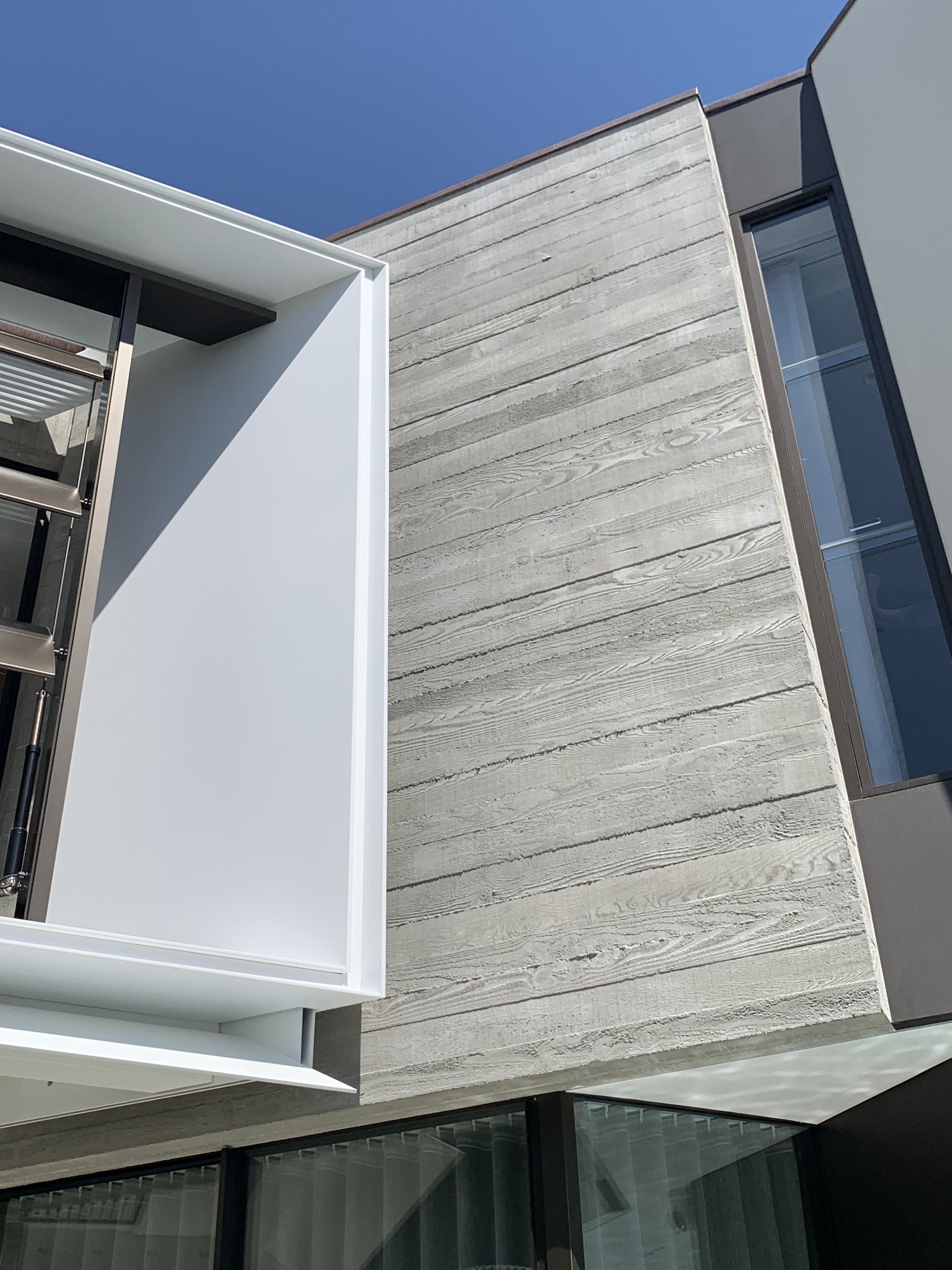
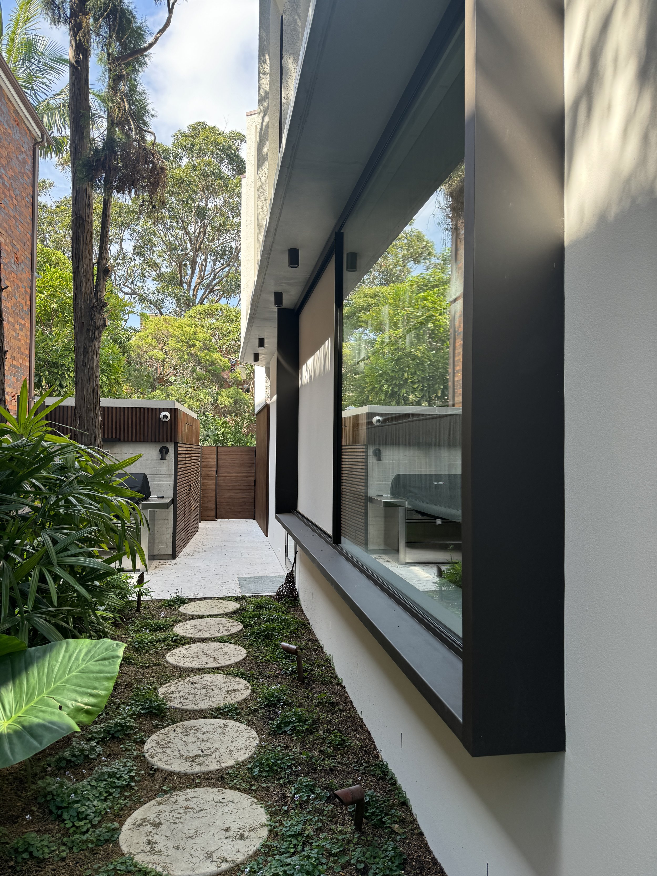
Orienting the house to the north west to take advantage of open sky and district views raises issues of potential excessive solar gain and privacy due to pedestrians using the access to the bay. A fine screen projecting 1500mm from the main façade was conceived for the upper level to address this. A carefully articulated projecting frame in combination with solid ellipsoid horizontal and perforated vertical electrically operated louvres provided the optimum solution, ensuring sustainability and amenity goals are met. The frame also offers shading to the ground level and contributes to façade articulation.
The building is carefully articulated using a combination of low carbon concrete both insitu and precast, thermally modified plantation timber cladding, rendered masonry and mosaic tiles. The first floor projects marginally beyond the ground floor base and is further reduced in scale using the timber cladding and high level glazing. Copper edge capped and timber lined eaves, projecting window boxes. a concrete entry canopy and a roof terrace embraced by snaking mosaic tiled walls complete the composition.
The crafted built form successfully addresses the corner, respectfully engages with its neighbours, and contributes to the public domain by greatly improving the streetscape and the pedestrian experience. Setbacks allowing for garden spaces in the public domain offer further enhancement along the site’s edges.
The complexities of the site demanded expertise from a small army of subconsultants however the collaboration with our industrial designers to resolve, fine tune and construct the projecting operable louvred screens was critical to the project. This required two sets of construction contractors operating on site at the same time and a successful delivery is a testament to the teamwork.
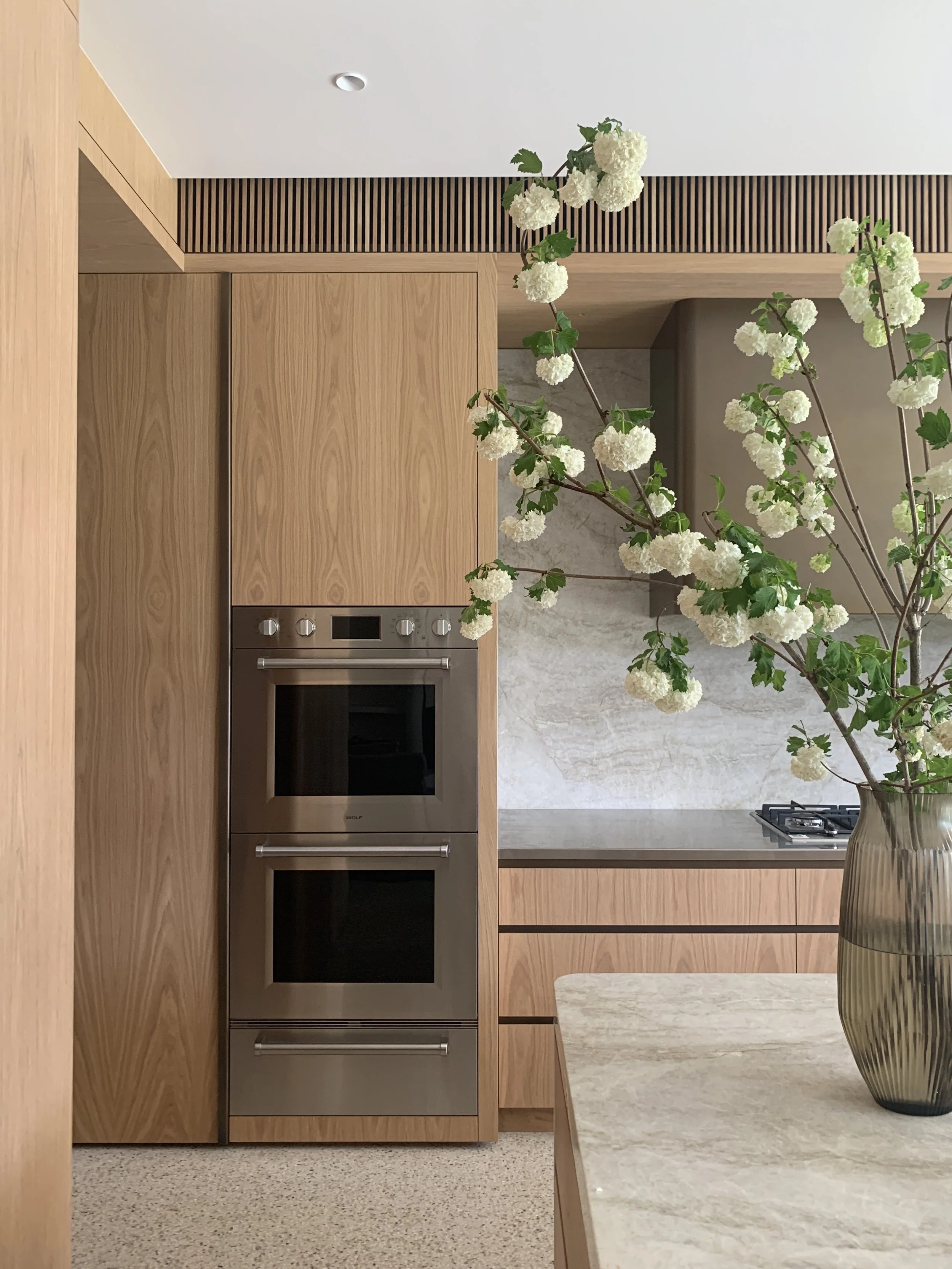
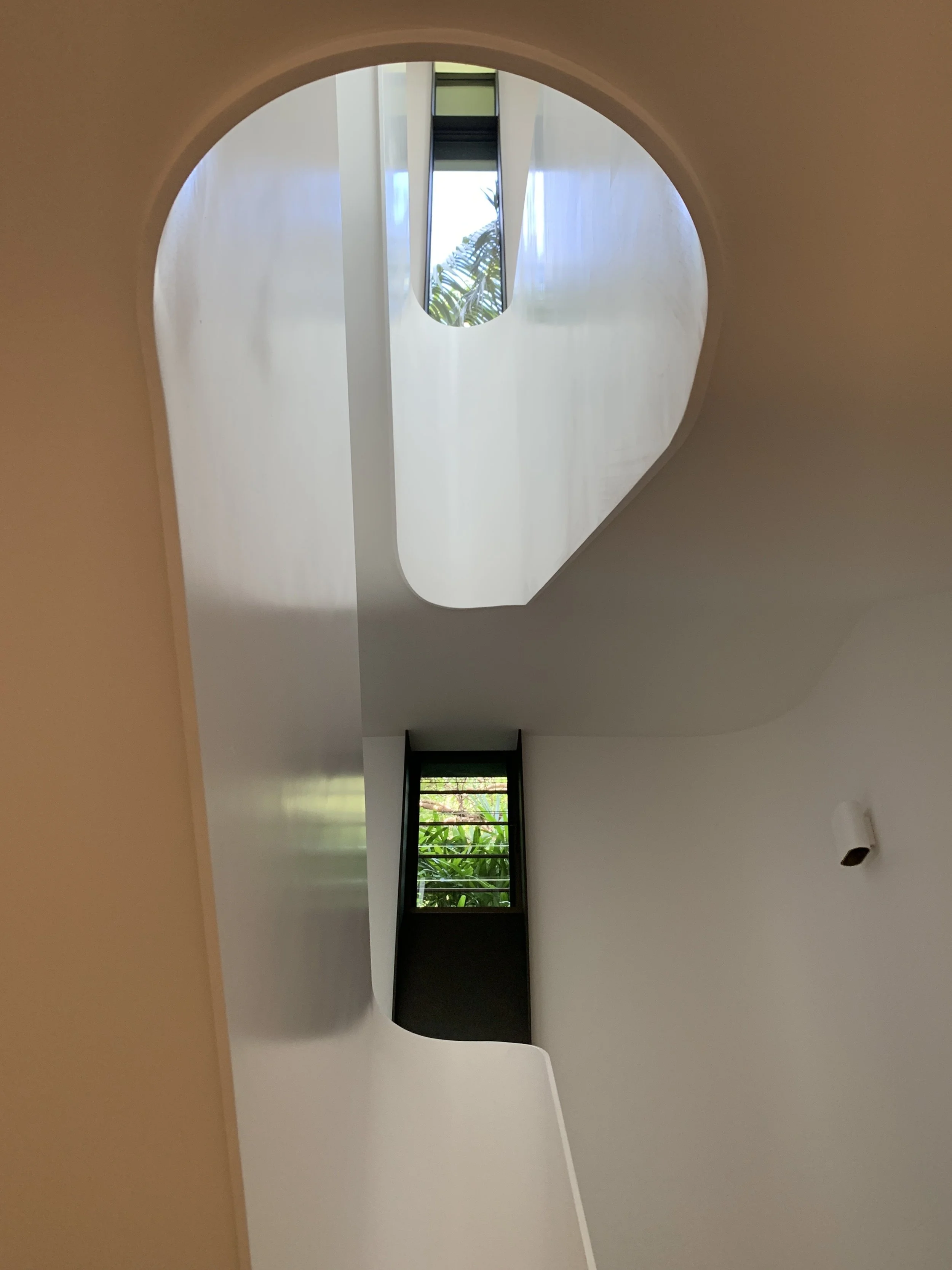
The planning is highly resolved functionally and spatially, given the program required multiple spaces in a reasonably small footprint. The spatial quality is such that each room provides the requisite level of function, comfort, and joy. The material and elemental selections are high quality, robust and responsible. It is a house that successfully accommodates an active young family unit which will serve them for decades to come.


